Raw data rarely tells a story on its own, but Excel can help you find one. Whether you’re a historian analyzing census records, a literary scholar tracking name trends in fiction, or a social scientist studying cultural shifts, Excel is a surprisingly powerful first step in any Digital Humanities workflow. It’s free (or nearly so), universally available, and capable of cleaning, summarizing, and visualizing structured data without writing a single line of code.
In this tutorial, we’ll use a real dataset: the 10 Most Popular Baby Names in New Zealand from 2001 to 2010 to walk through five core Excel techniques: importing data, writing formulas, sorting and filtering, building pivot tables, and creating charts. By the end, you’ll have turned a plain CSV into an interactive, visual exploration of a decade of naming culture.
What You’ll Need
- Microsoft Excel (2016 or later recommended) or Google Sheets
- The dataset: 10 Most Popular Baby Names NZ 2001–2010 (available from Statistics New Zealand)
Step 1: Importing the CSV File
CSV (Comma-Separated Values) files are the lingua franca of DH data. Almost every database, archive, and data portal exports in this format. Here’s how to open one cleanly in Excel. (Normally it will directly open if the filename extension is directly CSV or XLS)
- Check Comma as the delimiter, click Next, then Finish
- Open Excel and go to File → Open → Browse
- In the file type dropdown (bottom right of the dialog), select All Files so
.csvfiles are visible - Locate your file and click Open
- Excel will launch the Text Import Wizard. Choose Delimited, click Next.

Step 2: Using Formulas to Summarize the Data
Before visualizing anything, it’s useful to get a quick statistical overview. Excel’s built-in functions make this effortless.
Click on an empty cell (try cell G2) and type a label like Total Births (All Years, Girls). Then in H2, enter:
=SUMIF(C2:C201,"F",E2:E201)This uses SUMIF, which adds up values in column E (Count) only where column C (Gender) equals “F”.
Try a few more in the rows below:
| Label (column G) | Formula (column H) |
|---|---|
| Total Births: Boys | =SUMIF(C2:C201,"M",E2:E201) |
| Average Count per Entry | =AVERAGE(E2:E201) |
| Most Popular Single Count | =MAX(E2:E201) |
| Least Popular in Top 10 | =MIN(E2:E201) |
Step 3: Sorting and Filtering to Isolate Trends
Excel’s Sort & Filter tools let you ask targeted questions of your data without altering it permanently.
To filter for a single name across all years:
- Click any cell in your data, then go to Data → Filter (or press
Ctrl+Shift+L) - Small dropdown arrows will appear in each column header
- Click the dropdown on the Name column
- Uncheck Select All, then type
Sophiein the search box and check it - Click OK
You’ll now see only the rows where the name is Sophie, spanning 2001 through 2010. Notice how Sophie climbs from rank 7 in 2001 all the way to rank 1 by 2008, 2009, and 2010. That’s a story.
To sort by Count descending:
- Clear your filter first (Data → Clear)
- Click the Count column header dropdown
- Select Sort Largest to Smallest
The top result Joshua in 2001 with 590 registrations now sits at the top. You can see at a glance that boys’ names dominate the highest counts throughout the decade.

Step 4: Building a Pivot Table
Pivot tables are one of Excel’s most powerful features and one of the most underused in humanities research. They let you cross-tabulate and summarize data instantly.
Here we’ll build a table showing total name counts by year and gender.
- Click any cell in your dataset
- Go to Insert → PivotTable
- Excel will auto-detect your data range. Choose New Worksheet and click OK
- In the PivotTable Fields panel on the right:
- Drag Year to the Rows area
- Drag Gender to the Columns area
- Drag Count to the Values area (it will default to Sum)
You’ll instantly see a table showing total baby name counts per year, split by gender. This reveals that total registrations in the top 10 fluctuate year to year and that 2001 and 2010 was a notably high year for girls’ names. (My system setting is Chinese therefore I was not able to change the Excel language into English. But you get the idea!)

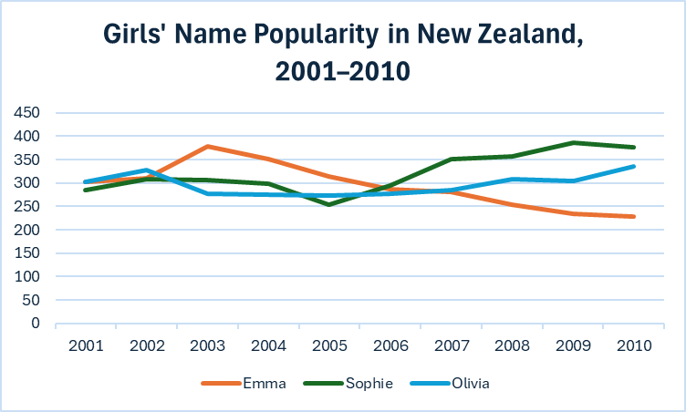
Step 5: Creating a Line Chart to Visualize Name Trajectories
Numbers in a table are useful, but a chart reveals the shape of change over time. Let’s track how a few girls’ names rose and fell across the decade.
First, build a small helper table from your filtered data. In a new sheet or empty area, manually enter (or use SUMIF formulas to pull) the count for three names: Emma, Sophie, and Olivia for each year 2001–2010. It should look like this:
| Year | Emma | Sophie | Olivia |
|---|---|---|---|
| 2001 | 303 | 285 | 303 |
| 2002 | 310 | 308 | 327 |
| 2003 | 379 | 307 | 278 |
| … | … | … | … |
Then:
- Select the entire table including headers
- Go to Insert → Charts → Line → Line with Markers
- Excel will generate a line chart. Click Chart Title to rename it: “Girls’ Name Popularity in New Zealand, 2001–2010”
- Right-click the chart and choose Select Data to confirm your series are labeled correctly
- Under Chart Design, try the different styles for a cleaner look
You’ll see Emma peaking in 2003 then declining, Sophie surging after 2006, and Olivia staying consistently popular throughout — three very different cultural trajectories in one glance.
Further Resources
Excel for Beginners – Microsoft Support Documentation: official tutorials covering all features used here
Excel Tutorial: practical guidance aimed at non-technical researchers
This is a really helpful tutorial, I did something pretty similar with google sheets. I agree with you that data visualization is a huge factor in humanities projects. Honestly, it was something I never realized but these techniques and tools can help us tell a story about humanities just as much as they can in economics or statistics. I am thankful to have learned these important techniques in class.
As someone who uses Excel quite a bit this was awesome to see! I really wish that the first time that I used the program, there was something like this to guide me through it. I really like how you included the outputs that are seen by each program you made a tutorial for, as a lot of the time in excel, I find myself looking up how to do something, with no real idea if the tutorial I am following is even for the right thing!