After spending the week learning how to apply mapping skills to Digital Humanities, the Week 5 lab allowed me to put some of this new knowledge into practice. In this post, I will outline the process I followed to create a personal map of Carleton, highlighting the locations that are important to me.
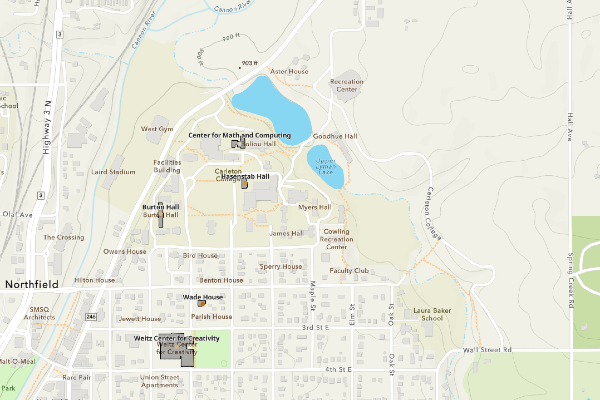
I started practicing in class by creating an initial map and playing around with various features. After finding some comfort with the ArcGIS platform, I began working on my personal map of Carleton, highlighting important places I frequently visit during the term. My process started by creating a spreadsheet of the five places I wanted to highlight, with six columns: Location Name, Function/Type, Days a Week Visited, Latitude, Longitude, and Address. To find the Latitude and Longitude of each location, I used Google Maps to pull the coordinates and official addresses.
I downloaded the spreadsheet and added it as a layer to a new map in ArcGIS. From there, I used the points and changed the symbology, which colors each point based on how many days I go to the location per week. I then added a polygon layer, which provides emphasis and an outline for the buildings I point out on the map. Each colored point can be interacted with; a pop-up appears with more information about the location, and each point has a label with the building name.
I found ArcGIS difficult to understand and use at first. However, after working with it more, I better understand its potential uses and capabilities. Web mapping offers new ways to represent geographical information in the Digital Humanities, especially as many questions researchers ask highlight information across the globe. In creating my map, I only scratched the surface of the ArcGIS platform’s capabilities, as there are a multitude of other tools and representations that can be used in the displays. One of the most prominent features, with implications for the program’s use, is its data management, which allows you to make changes to the dataset you use. While this might not be particularly helpful with an extremely large dataset, it is more forgiving than editing features alone.
I really like how clean and easy to understand your map is. The bold labels and dots corresponding to frequency convey a lot of information but are not overwhelming. If you were to expand on this project, what other parts about your Carleton campus routine would you include? What ArcGIS features would be useful here?
I really liked how clearly you explained your process, especially using symbology to show how often you visit each location. The building outlines add helpful spatial context, and your reflection on ArcGIS being difficult at first but easier over time felt very relatable.