The data used in this visualization come from the Carl in China digital collection hosted by Carleton College: https://contentdm.carleton.edu/digital/collection/Carl_In_China. The dataset consists primarily of historical photographs taken in Beijing in the 1930s. For this project, the photographs were selected and organized based on identifiable locations so that they could be connected to modern geographic coordinates.
To visualize the data, we used ArcGIS, which allows historical materials to be placed on an interactive geographic interface. Using ArcGIS tools, we created a map where each location corresponds to one or more historical photographs from the collection. ArcGIS also enables interactive viewing, allowing users to click on locations and see the historical images connected to that place. Further we will be employing the map to Stroy Map using ArcGIS for better illustration.
The visualization functions mainly as an exploratory and comparative tool within the project. By placing the historical photographs on a modern map, the visualization allows viewers to compare past and present urban environments more easily. Instead of viewing the photographs as isolated images, the map situates them in their spatial context, which helps reveal how certain areas of Beijing have changed or remained similar over time.
To improve clarity and usability, we experimented with different map styles and visual design choices. Adjusting the basemap style and visual emphasis helped make buildings and streets easier to compare between the historical photographs and the modern city layout.
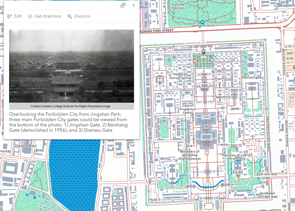
One image comparison can be seen: